Hi all, Madge here with my last post for the month of April for OCS. Today I’m going to share a (very simple) tutorial on how to make cuts in Patterned Paper to make it work with your image while also adding an element. This will also take you Step-by-step on how I made this card. Prepare to sit a while!
First: Here is a little tip that I discovered while doing my nails (don’t ask!). This little bottle of “Base Coat” Nail Polish is absolutely fantastic for making your black lines “POP” from your colored images!!! - comes with it’s own little brush!! - from the $$$ store. AND it also adds a slight gloss and stiffens your cut image!! WOW – all that from an
sloppy mistake errrrr, experiment. Ask me how I know that, in fact the blacks became more vibrant?. . . . well, while the puddle, ummmmm, application was drying, I screeched “OMG “ ummmm, hypothesized the abnormal change in depth of color and made a mental note to myself . . . . clumsy jerk
phew, well that turned out ok.
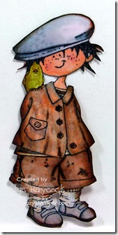
OK, on with my tutorial…….. I started with this little image of Snoesjes - Snoes with Bird, from Marianne Designs – available at OCS. This little fella really grew on me………. I stamped the image onto XPress It Blend Cardstock, with Memento Tuxedo Black , colored it with Copic Markers and fussy cut him out. (Sometimes a light bulb goes on, sometimes a candle flickers) Here’s what I did to bring my card to fruition.
Next I chose some masculine papers and elements – for April’s OCS’s Masculine Challenge. The DP paper is from an Authentique Paper Collection

I sponged Tim Holtz Distress Ink, “Tea Dye” to all the papers to give a Vintage look.
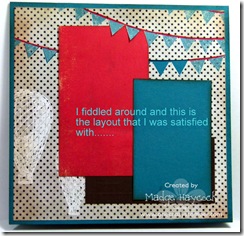
Then I began to place color blocks until I was satisfied with the result.
The red color block was positioned under the cut-out. I also penciled in “H-A-P-P-Y B-I-R-T-H-D-A-Y” onto the banner.

3 Dimensional foam squares were placed on back side of image.
I added the elements, (stars, feather and twine) to the card and placed the image over the twine – placing the sentiment in between the twine to give a matted look.

Above, is the finished result ~ Colorful, masculine and regular postage rate thickness for mailing. I also added papers to the inside of the card – for more “eye candy”.
Til Next Time. “Stamp up a storm, ink up a wish – and send it on to brighten someone’s day”.
~ rubber hugz ~
First: Here is a little tip that I discovered while doing my nails (don’t ask!).
 This little bottle of “Base Coat” Nail Polish is absolutely fantastic for making your black lines “POP” from your colored images!!! - comes with it’s own little brush!! - from the $$$ store. AND it also adds a slight gloss and stiffens your cut image!! WOW – all that from an

OK, on with my tutorial…….. I started with this little image of Snoesjes - Snoes with Bird, from Marianne Designs – available at OCS. This little fella really grew on me………. I stamped the image onto XPress It Blend Cardstock, with Memento Tuxedo Black , colored it with Copic Markers and fussy cut him out. (Sometimes a light bulb goes on, sometimes a candle flickers) Here’s what I did to bring my card to fruition.
Next I chose some masculine papers and elements – for April’s OCS’s Masculine Challenge. The DP paper is from an Authentique Paper Collection


I sponged Tim Holtz Distress Ink, “Tea Dye” to all the papers to give a Vintage look.

Then I began to place color blocks until I was satisfied with the result.
The red color block was positioned under the cut-out. I also penciled in “H-A-P-P-Y B-I-R-T-H-D-A-Y” onto the banner.


3 Dimensional foam squares were placed on back side of image.
I added the elements, (stars, feather and twine) to the card and placed the image over the twine – placing the sentiment in between the twine to give a matted look.

Above, is the finished result ~ Colorful, masculine and regular postage rate thickness for mailing. I also added papers to the inside of the card – for more “eye candy”.
Til Next Time. “Stamp up a storm, ink up a wish – and send it on to brighten someone’s day”.
~ rubber hugz ~


Madge, a great card and fabulous tutorial.
ReplyDeleteGreat card! The base coat reminds me of glossy accents!
ReplyDeletesuper tip Madge! I love happy accidents! Great card
ReplyDeleteLOVE IT Madge!! So glad you inked this little guy, he is just great! Cheers, Lora
ReplyDeleteGreat card Madge - love all the detail and thanks for the tutorial.
ReplyDelete